Communicating effectively with the public requires subtle touches, like whispering into a potential buyer’s ear and urging them to pick your brand over everything else on the market. An astute nudge in the right direction eases customers into feeling inspired by branding tactics, rather than commanded.
That’s where logos come into play.
If billboards and commercials are strangers screaming in a consumer’s face, logos are a soft tap on the shoulder from an old friend. They can build a substantial relationship between a business and its customers, encouraging them to recognize and remember the brand throughout their everyday lives.
And for the brand and its marketing team, understanding how different types of logos influence brand identity and scalability is key—whether the logo is for a new brand readying to launch or for an existing brand’s redesign. Just as a good logo remains in a customer’s mind, the wrong one can turn them off forever. Familiarizing yourself with the eight core logo types can help you create one that will add interest and remain memorable, elevating your brand’s recognizability and marketability over time.
Using Words
Wordmark
Examples: Google, Coca-Cola, Disney, Mobil, The New York Times, eBay, Panasonic, Canon
There is nothing simpler than taking your company’s name, writing it out in an attractive font, and using it as your brand’s logo. It’s ideal for new businesses that still need to work on instilling their name in customers’ heads.
However, a wordmark logo only works for brands with short or snappy names. Think of the way Google, Disney, and Coca-Cola just roll off the tongue. Even the New York Times has a flow that makes it work.
Lettermark or Monogram
Examples: Louis Vuitton, Chanel, NASA, IBM, the New York Yankees, Hewlett-Packard, Volkswagen
Companies aiming to honor their brand’s name without directly spelling it out will appreciate a lettermark or monogram. This type of logo takes one to three of the brand’s recognizable letters—think LV for Louis Vuitton or VW for Volkswagen—and turns them into a distinct trademark.
It’s a compromise for companies with wordy, hard-to-digest names. Sometimes, a monogram logo becomes so interchangeable with a brand’s identity that people may not recognize the full name, such as with American Broadcasting Company (ABC). Monograms work best for companies that already have a solid following—otherwise, it’s just a bunch of ambiguous letters.
Letterform
Examples: McDonald’s, Netflix, Yahoo, WordPress, E! Entertainment, General Mills
Brands on their way to becoming household names often create a downsized version of their logo. Cutting it down to a single letter makes it even easier to pop into customers’ heads. Called letterform logos, these can be incredibly effective when used correctly.
All it takes is seeing Netflix’s signature bold, red N and you’re immediately prompted to cozy up on the sofa to binge your favorite series. These types of logos work best for established brands and might even emerge later in a company’s life, with many top brands starting with a wordmark logo and evolving into a simpler letterform as they grow. For instance, the first three iterations of Netflix’s trademark spelled out the company’s entire name in a wordmark logo before they finally adopted their iconic, minimalist N in 2016.
Using Symbols
Pictorial
Examples: Apple, Twitter, Target, Shell, Domino’s, Dropbox
You don’t need words to communicate through logos—some of the best in history are pictorial. These logos encompass a brand’s identity in a basic symbol. They’re clever copies of the name through pictures, such as Target’s bullseye or Dropbox’s open-box graphic.
Symbols can be very powerful, as imagery can evoke deeper emotions and connections than words. That said, it’s much more difficult to nail down an image that resonates with a brand name than it is to work with letters. Ask any branding or design team, and they will tell you to settle in for the long haul, as it’ll take some serious time and effort to develop just the right one.
Mascot
Examples: Disney, Michelin, Nintendo, Cheetos, Pringles, M&M’S, Kool-Aid
If you can’t twist your brand’s name into a recognizable logo, adopt a mascot to build identity. Mascot logos do well because they give consumers someone to trust. Generations have resonated with Mickey Mouse, Chester Cheetah, the M&M’S characters, and the Kool-Aid Man—they feel like they know them. Creating a lovable personality as a logo develops brand trust.
Abstract
Examples: Nike, PlayStation, Pepsi, Chase, the Olympic Games, PBS, BP, John Deere
Brands that consider themselves creative and possibly even cutting-edge may opt for an abstract logo to represent themselves. These logos don’t blatantly state the brand name, like pictorials do; rather, they adopt artful symbols or shapes to represent their brand.
Nike’s Swoosh is a prime example of an impactful abstract logo. But they didn’t originally launch their brand with the Swoosh as their identifier. Instead, Nike started by using a combination logo to introduce the Swoosh to the world. Once people knew the brand, they dropped the name and only used their memorable abstract Swoosh. Now, the symbol itself is just as valuable as Nike’s products.
Hybrid
Combination
Examples: Adidas, Amazon, Mastercard, Airbnb, Hallmark, Microsoft, Doritos, PayPal, Spotify
Combination logos are the best of both worlds for new brands, allowing a company to get its name out there while building an association with a signature trademark symbol at the same time. The double benefit makes it one of the most popular types of logos, used by powerhouse brands such as Airbnb, Amazon, and Adidas.
Emblem
Examples: Starbucks, the National Football League (NFL), Stella Artois, Harley-Davidson, BMW, Perrier
Emblems are a form of a combination logo that elicits a sense of traditionalism. In these logos, all text must go inside the symbol or icon. Originally used by universities, today emblems are a favorite logo style of brands in all industries and are famously used by Starbucks, the NFL, and BMW.
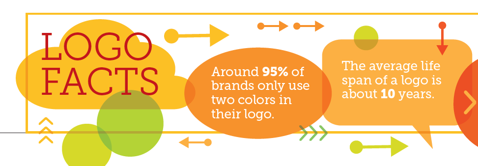
Logo Facts
- Around 95% of brands only use two colors in their logo.
- The average life span of a logo is about 10 years.
- Fortune 500 companies by logo type:
- Combination – 61%
- Wordmark – 31%
- Lettermark – 5%
- Emblem – 2.4%
- 60% of consumers will avoid a brand with a logo they find odd, ugly, or unappealing.
- On average, a customer must see a logo five to seven times before remembering the brand.


