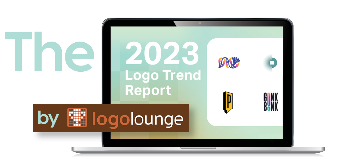
What do flora, asterisks, and Ritz crackers have in common? They’re all trending elements in corporate logos, according to the 2023 Logo Trend Report from LogoLounge, a digital library of more than 400,000 logos from around the world. And as such, they all in some degree reflect changes in society, according to Bill Gardner, founder of both LogoLounge and Gardner Design.
Any logo is a symbol, and a symbol conveys something to you for a reason,” Gardner says.
Take flora. Among the more than 30,000 logos analyzed by Gardner and his team in 2023, a significant number featured flowers, vines, leaves, and other botanical elements. Gardner believes the increase in such logos occurred for the same reason that more than 50 percent of all beverages introduced last year had some sort of floral flavoring: a post-COVID appreciation of health, nature, and the health benefits of nature.
Gardner contends that the growing prominence of asterisks—or rather, half asterisks, or halfasters, as he calls them—is tied to the symbol’s longtime use to indicate footnotes in text. “They’ve become symbolic of something that’s there that we are now disclosing or calling attention to,” he says. The fact that a bisected asterisk can also symbolize sparkle (especially when placed atop a diamond, as in the logo for Iowa jeweler Ames Silversmithing) adds to its appeal.
As for Ritz crackers, it’s their scalloped shape that Gardner saw repeatedly in logos. Reminiscent of a badge but, thanks to its ruffly circumference, more accessible, the shape calls to mind the imprimatur of a friendly authority.
Yet trends in logo design, and in visual identities overall, also reflect the technology at a designer’s disposal, Gardner notes. “When designers are introduced to a new tool, they usually use it in the simplest of fashions. For instance, if they’re given a tool that allows them to use a gradient, they’ll stick that gradient in a logo and then explore the tool more broadly.”
If the logos Gardner reviewed are any indication, designers have also become more comfortable with blurring tools. And when that mastery of a tool coincides with a societal trend, such as an increased desire for approachability, you have logos such as those for Swedish music platform Blurry and Romanian neural-training firm Veruvis.
Though Gardner calls his annual compendium of such insights a trend report, he takes pains to note that “we’re not talking about trendy. We’re talking about the trajectory of something. Think of it as evolution.” And so, the use of variable fonts within a wordmark highlighted in the 2021 report morphed into 2023’s increased use of elongating or expanding just one or two characters in a wordmark. Likewise, the semicircular shapes of 2022’s macaroni trend, which suggested both flexibility and simplicity, evolved into the more complex spiral trend of 2023. The fact that spirals are inherent in nature—the Fibonacci sequence and the golden ratio are apparent in everything from hurricanes to nautilus shells—might also have contributed to their popularity in logos this year, reflecting once again the recent re-emphasis of all things natural and organic.
Another overall trend Gardner has noted is “a crossing of cultures.” “For instance,” he says, “I’m starting to see more Eastern styles of clouds with wind drifting into Western logos. Because we spend so much time on the internet now, it’s so easy for cultures to spread.” At the same time, he admits that his trend reports are relatively Western-centric. He recalls a Russian logo with a washing machine that appeared to be standing on chicken legs, which seemed nonsensical until he became aware of Baba Yaga, a folkloric figure who lives in a house that stands on chicken legs and is as well-known to Slavs as Snow White is in the West. “When you start to think about trends you realize that different places around the world react to things differently,” Gardner says—vital to keep in mind when designing logos for international brands.
Also important to remember is what he calls the “generational gap of symbol recognition. Unless you want to appeal to only one generation, [you] have to create meaning in logos that crosses generations.” The lightning bolt that on Greek coins looked more like a sheaf of wheat used to symbolize punishment from Zeus; now zigzag lightning bolts represent brilliant ideas. A somewhat subtler shift, in an appreciably shorter time span, relates to the ellipsis. Thanks to texting, it has morphed from symbolizing “to be continued” or a gap in time to representing someone in the process of typing.
In short, societal changes, cross-pollination of cultures and generations, and technological advances all contribute to trends in logo design. They’re also why “even a company with the most valuable logo is continually tweaking it,” Gardner says.
One such company is Coca-Cola. The details of its script logo have been modified in numerous ways since its creation in 1887—e.g., the slant of the letters exaggerated and minimized, a ribbon introduced beneath the name—yet throughout these changes it has remained instantly recognizable. Another global brand, Nike, discovered that its Swoosh had become so recognizable, it was able to remove the wordmark entirely from the logo with no ill effects. In fact, removing the four letters might have made the brand even more accessible to consumers in countries that don’t use the Latin alphabet.
“If you’re a good brand, you’re continuing to update the elements of a logo that allow it to remain current and on trend,” Gardner says. “When you see logo changes, that means corporations are being good stewards of their brands.”